Email accessibility is all about making sure everyone, including people with disabilities, can actually read, understand, and engage with your content. And guess what? A few small tweaks can make a huge difference in making your emails more inclusive, user-friendly, and effective.
Why Should You Care About Email Accessibility?
Accessibility isn’t just a “nice to have”—it’s a must. Millions of people rely on screen readers, keyboard navigation, or high-contrast settings to browse digital content. If your emails aren’t accessible, you’re unintentionally shutting out a chunk of your audience—and that’s not cool, right?
The good news? You don’t need to be a developer or accessibility expert to make a big impact. Here are three quick and easy improvements you can start using today.
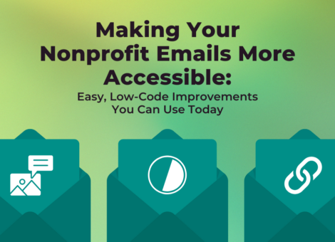
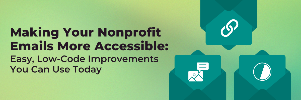
Quick & Easy Accessibility Wins for Your Emails
- Add Alt Text to Your Images
Why? Alt text ensures that visually impaired users using screen readers can understand the content of your images. If an image has no alt text, a screen reader might just skip it entirely or worse—read out the file name (not ideal!). Additionally, if a user’s email client or email settings blocks images by default, any information inside an image is lost without alt text!
How? Most email platforms—like Mailchimp, Engaging Networks, and Pardot, just a few of the tools we support our clients in using—have an easy-to-find field for adding alt text when you upload an image. No coding required!
Tips on Alt Text: When writing alt text, be sure to keep it short and descriptive – but don’t overdo it! Think about what the image’s meaning is, and what the intent of the image is within the context of the email. Be as descriptive as is useful and write out any of the text that you might have embedded in the image as well. But keep in mind that most people only look at images for a few seconds, so there’s no need to write a short essay! If your graphic is especially complicated, consider elaborating elsewhere in your email. One last thing to note: if the image is decorative you can leave the alt tag field empty.
- Check Your Color Contrast
Why? Bad color contrast makes it difficult for people with low vision or color blindness to read your content. But let’s be real—it makes things harder for the rest of us too! for everyone. Email legibility is critical. We work so hard to get users to open our emails, let’s make sure they can actually read them!
How? There are a ton of online contract checkers that make this as easy as using an eyedropper to select your foreground and background colors or dropping in the color Hex Codes. WebAIM has a great and easy to use tool to check with. We’re looking for a contrast ratio of at least 4.5:1 for normal text, 3:1 for large text. If you have a white background with yellow text, that could be hard for folks to read – inversely, a dark background with dark text has the same effect.
- Use Meaningful Link Text (And Make Links Obvious!)
Why? When using a screen reader to navigate using links, a link that reads just “click here” isn’t particularly helpful.
How? Generic links like “Click here” and “Read more” aren’t helpful without context, so you should keep your links informative and to the point. Further, make sure a link is formatted differently than the rest of your copy so it can clearly be identified as a link. There is a reason browsers underline hyperlinks by default: users are accustomed to this experience. While we can remove underlines on links with code and style, we generally advise keeping it so it can function as a clear visual marker to the reader. My go-to is to make a link underlined and bold (and to take color contrast into consideration as well here as well).
Want to Dive Deeper?
Here are some more resources to learn more about accessibility. These tips extend from email and into all of your web stuff as well. Even social media channels are beginning to make adding alt text into images easier and easier.
- WebAIM: Email Accessibility Guide – A comprehensive breakdown of best practices.
- The A11Y Project – A fantastic resource hub for all things digital accessibility.
- W3C’s Web Content Accessibility Guidelines (WCAG) – The web standards for all things accessibility.
- Litmus’ 025 Guide to Creating Accessible Emails – I turn to Litmus for a lot of my email knowledge and this guide is pretty comprehensive!
- Accessibility Report 2024, Email Markup Consortium – The EMC analyzed hundreds of thousands of emails across several sectors to come up with some of the most common and critical accessibility issues in emails (links and image alt text are on the list!).
Progress Over Perfection
Accessibility doesn’t have to be overwhelming. You don’t need to fix everything overnight—just start with one or two small improvements, and build from there because when you prioritize accessibility, everyone wins. Start making your emails more accessible today!
Need Help Making Your Nonprofit’s Emails More Accessible? Fresh Eyes Digital is here to help! Whether you need support with email strategy, design, or accessibility improvements, we’ve got you covered. Reach out at sayhi@fresheyesdigital.com and let’s make your emails more inclusive together!