Design plays a vital role in our daily lives. When it comes to digital marketing and fundraising for nonprofits, better design means more robust storytelling and brand recognition. It means higher conversions and better user experiences. And in the best cases, design is not only pretty, moving, striking, or bold, but memorable too.
Over the past ten years, I’ve worked with many nonprofit organizations in-house and as a consultant. Here are four of the most common, practical tips I have to share about digital design and everyone’s favorite tool: Canva.

1. Sign up for Canva for Nonprofits
If a nonprofit is lucky enough to have designers on staff, chances are they still can’t handle every single need across departments (believe me … I’ve tried!). Scrappy communications and fundraising departments might be tasked with creating visual collateral without the budget to hire out for all those needs.
Enter Canva: a browser-based free design tool with a gentle learning curve. It’s a drag-and-drop tool with many templates and built-in file dimensions for everything from presentations and letters to social media and even video. The uses are endless. It is 100% free, and anyone can create an account at any time.
Nonprofits are eligible for free access to Canva Pro, which takes all of that and adds unlimited access to additional assets and tools. That includes their massive library of stock images, videos, audio, graphics, and more. You can set up a Brand Kit and brand templates for your organization so you can lock in those colors and logo variants and even upload your own custom fonts.
There’s also a wonderful feature called Magic Resize that can give you a huge head start on taking a graphic for your emails and prepping them for social and more. You can edit images, remove backgrounds, add filters — the list goes on. Plus, there is an expanding offering of AI-powered tools like a fabulous Magic Eraser to isolate images, copy support with Magic Write, and more.
Sign up if you are a nonprofit and aren’t on Canva Pro! It’s free! With a little training and practice, you can have a whole organization of folks able to create quick and easy collateral and ensure it is on-brand, too.
2. Use These Lesser-Known Canva Tools
Canva truly has made design more accessible. Because it is a free tool, the barrier of entry is so much lower compared to other design software that require subscriptions or high up-front costs, plus the fancy tech specs to run them. You may already be super comfortable using this powerful little tool already; so many people are. So here are some lesser-known tools and functions that can help your designs feel polished and professional. Use Canva’s grids, rulers, and guidelines and take advantage of the spacing and position tools.
Ruler, Guidelines, Grids
Use your grids, rulers, and guidelines! An underlying grid system, even a simple one to maintain your margins, will help you place text, images, and more in a balanced and intentional way. It also speeds up the design process because there is less hmm-ing and haa-ing around where the text looks correct.
How to turn on your rulers
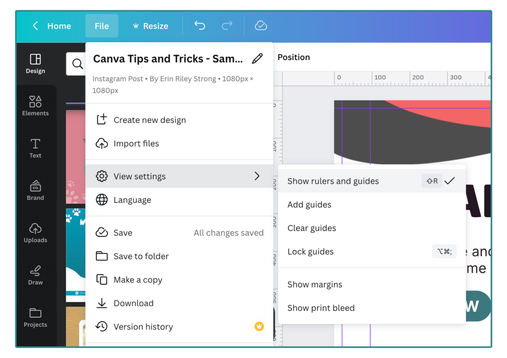
Go to File > View Settings > Show Rulers and Guides
(Pro-Tip: You can also use the shortcut SHIFT + R).
With your rulers in place, you can click on the top or left ruler and drag out a guide line. Place that guide line anywhere you need on your design to guide your work. These guides will not export in your final file. You can turn off your guides the same way you turned them on.
You can also set up an auto-grid.
Go to File > View Settings > Add Guides
Then you have an option for their default columns or custom ones. I regularly set up something like this for social ads and assets:
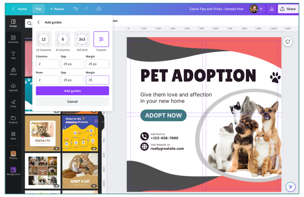
This gives me a solid margin to adhere to and helps me find the center in each quadrant.
Pro-Tip: You can use rulers and guides in software like Google Slides and Powerpoint – it’s a game changer. Tell a friend.
Spacing and Position Tools
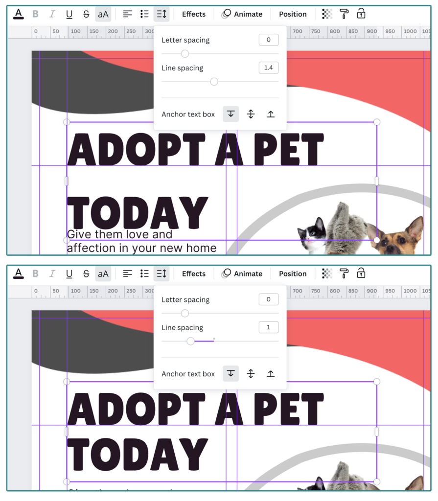
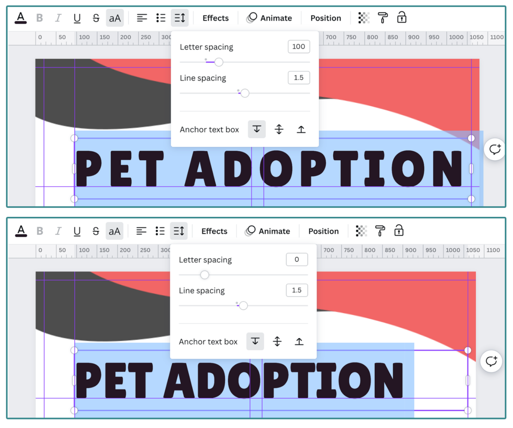
Take advantage of your spacing and positioning tools. While not as robust as you might get in a letter-by-letter detail in software like Adobe InDesign, you do have some adjustment options for the line height and sentence kerning. The default for headline text in Canva seems to be set to 1.4, so I very regularly see text set far apart as a result. Letter spacing is further limited, but definitely a useful tool to have in your toolbox. Sometimes if two letters are particularly unruly (like an A and a W, for example), I will layer text boxes and manually adjust spacing that way.
How to adjust your spacing
To adjust your spacing, select the text box you want to modify, and in the menu, the icon with the lines and arrows allows you to expand or shrink the space between lines (line spacing) or letters (letter spacing).
How to use your position tools
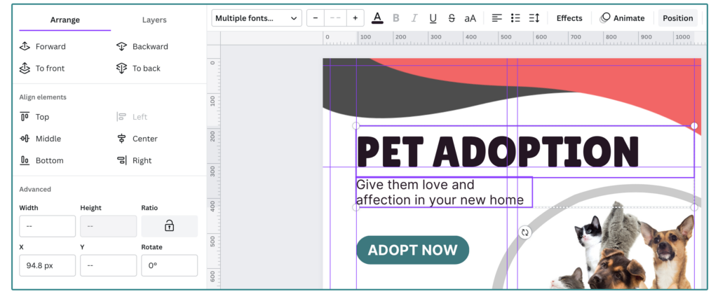
Paired with the grids and guides above, I use the position tools every single time I make anything in Canva. Use these tools to line up your elements in relation to each other. It is a fantastic way to tidy up your text, photos, and more to pixel-perfect precision.
With your various design elements, select the Position option in the menu (if you don’t see, you might have to select the … button to see the full menu).
The position tools include all of the following options:
- The Forward/Backward/To front/To back options (and the Layers tab) allow you to rearrange the order of your element layering. This can help you arrange your shapes and colors and help them look how you want.
- The Layers tab is convenient if your design has a lot of overlapping elements. It can help you rearrange as well as just select the one element you need.
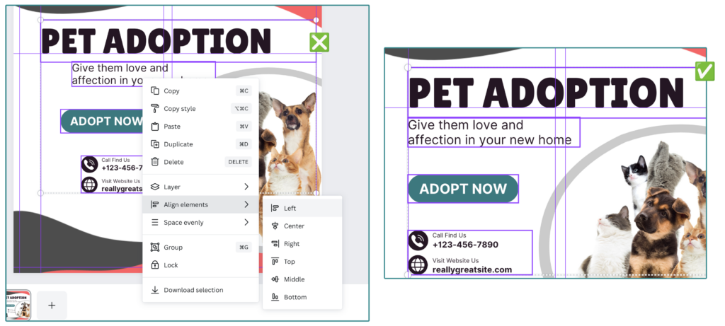
- Align elements (or align to page if you only have one element selected) allows you to align elements in relation to each other (or to your canvas!).
- Space evenly helps create balanced amounts of space between elements, this is visible only if you have more than 3 elements selected.
- The Advanced Panel allows you to define by pixel the size and placement of your element on the canvas.
Using Your Alignment Tools
You can use the menu method shown above, with your elements selected to apply the adjustments. You can also find some of your position tool by right-clicking on your selected elements and finding it in the pop-up menu.
Pro-Tip: There are alignment tools and layering options in Powerpoint and Google Slides too!
3. Pay Attention to Design Accessibility
Truly, accessibility for email and web can be a whole blog post on its own – but I will highlight some of the elements you can keep in mind when designing and working with images in your digital campaign work.
Contrast and Legibility
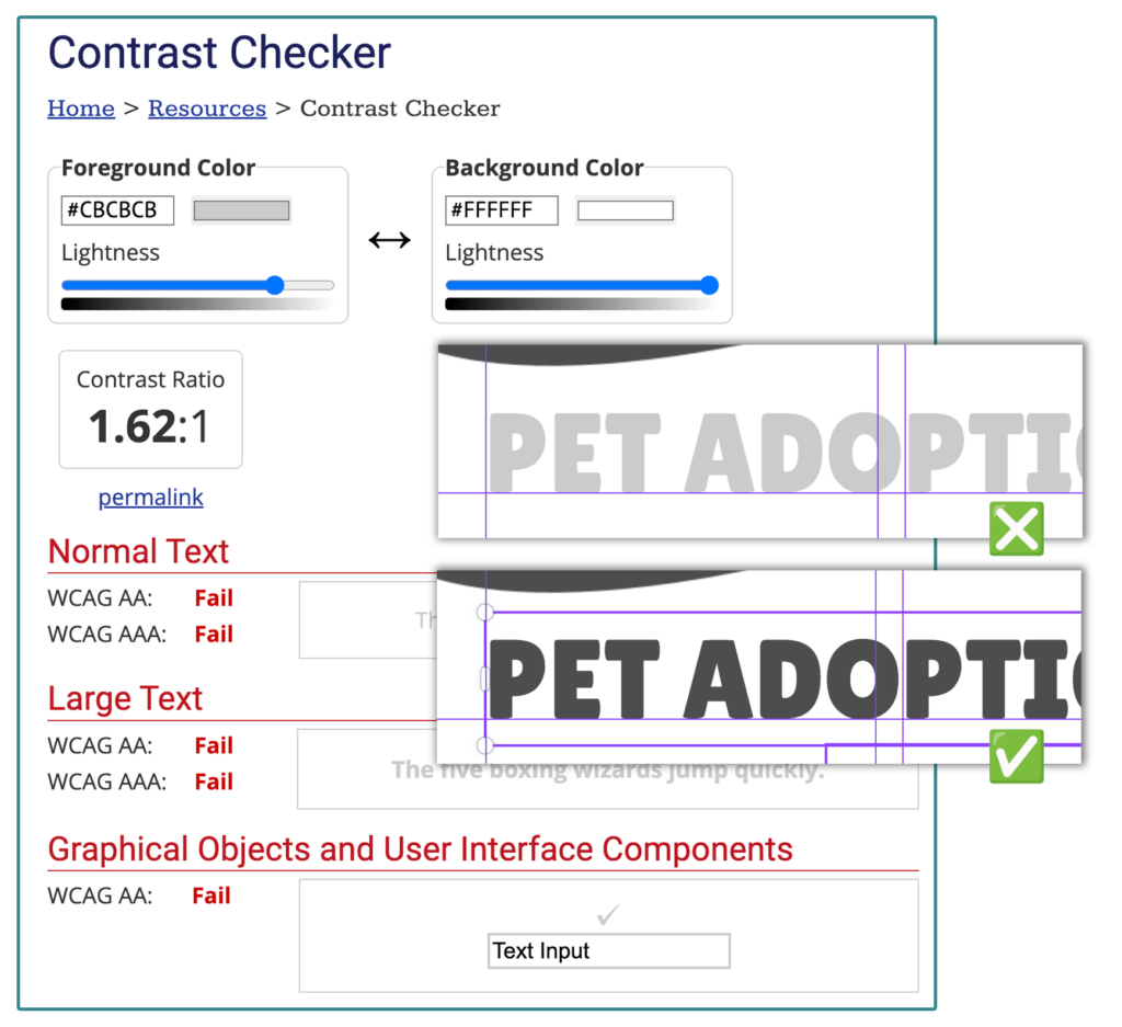
When making color selections, make sure that there is sufficient contrast between your foreground and background. For example: if your text is light and is also on a light colored background, folks might have difficulty reading it. Along the same lines, make sure your text is large enough and clear enough for people to read. Taking contrast into consideration will make your content accessible to folks with low vision or colorblindness, as well as people consuming your content on the go.
There are a number of free tools online to check your Hex Colors so you can check to see if you have met the WCAG recommended standard. Here are a few online tools and resources:
- WCAG Color Contrast Checker – Accessible Web
- Contrast Checker – WebAIM
- Accessible Color Generator – Learn UI Design
- Color Contrast Checker – Coolors.co
- Make your images and videos more accessible – Canva
Alt Text
Make it a priority to add alt text into the images you implement online – on any platform! Not only is this a good practice in case your images don’t load (here’s looking at you, Outlook). It is also helpful for folks using screen readers and other tools.
If the image is purely decorative, you can leave it blank, but especially if there is important information in the graphic, whether it is a call to action, or a chart/graph that is not described or explained in your copy: give it alt text! Describe the image, be specific, and add context, but also be sure to keep it short. Not only does making your digital content more accessible help you reach the over 250 million people in the world who require screen readers to access the web, but alt text is apparently also great for website SEO, so it’s a win-win.
Here are some some helpful links:
- Alternative Text – WebAIM
- Image Alt Text: What It Is, How to Write It, Why It Matters to SEO – Hubspot
- Tips and Tricks – World Wide Web Consortium (W3C)
- Alt Text – Moz
4. Practice Makes Perfect
My final piece of advice is just to practice. I have a design degree, but so much of what I do in my digital work I learned on the job, and I have to continue to keep learning and growing as technology evolves as well. The more time you spend being creative and experimenting with design, the more you’ll pay attention to the design you see around you, which in turn helps inform your future work.
I only started using Canva myself about two years ago, when I joined the Fresh Eyes Digital team, because our clients were using it. So I self-taught! You can too! What I have found helpful is to look at the templates Canva offers and see how other designers have set them up. How are they using the tool to make it work for them? Then I take those learnings into my own work.
Don’t be afraid to give it a whirl.


I hope that these tips are useful – even if I can help one headline have a tighter line height, I’ll rest easy tonight. 😜 And if you need design help in Canva, your email marketing tools, your website, or even your advertising program, reach out! We’d love to hear from you.
Fresh Eyes Digital provides campaign strategy, content development, and data analysis and dashboards – we also offer robust design and production services. Reach out to sayhi@fresheyesidigital.com if you’re interested in learning more.

